ShopDreamUp AI ArtDreamUp
Deviation Actions


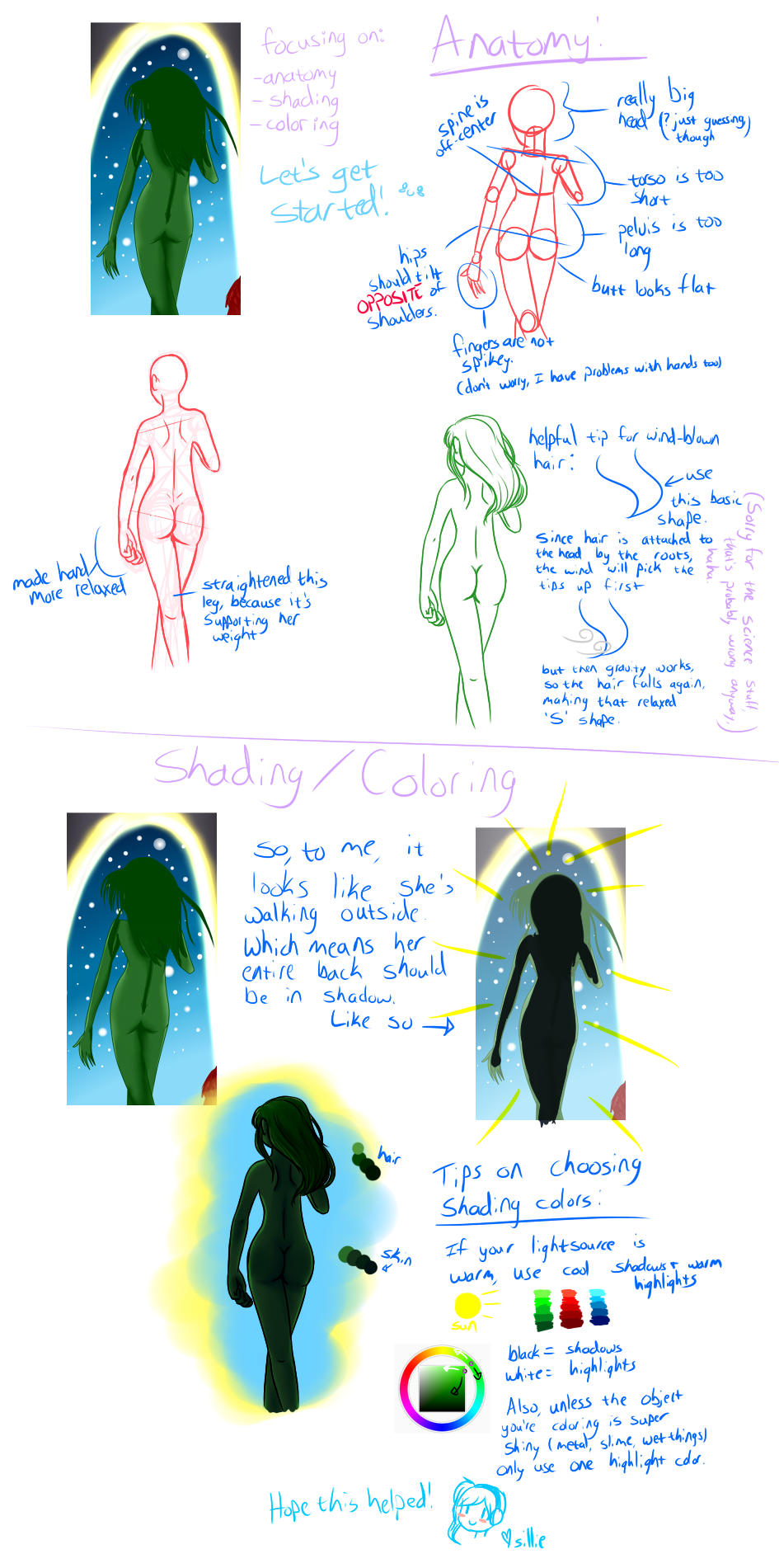
Description

Correction for: ~IndigoMittens
Original: [link]
I wasn't sure if she was an alien or not, but I figured that if you put it in the "correct me manga" folder, that you'd want a redline of human anatomy. xD
Please don't hesitate to ask if you need something clarified (especially if you can't read my handwriting, haha, I know it's a messy pit xD).
Also, some other tips that I forgot to put in the picture:
Try to avoid lineless hair when you outline the body/clothes. It looks really strange, in my opinion, and like the hair is detached from the figure and was just floating there. So either outline all of the picture, or do it all lineless. It makes it look more cohesive and like it all fits together. c:
Hope this helps!
Image size
945x1901px 687.23 KB
© 2013 - 2024 lockandkye
Comments3
Join the community to add your comment. Already a deviant? Log In
Just wanted to point the last bit out that You shouldn't shade/highlight with black/white. You would want to go around the colour wheel and shade with those colours instead. Ex: Green: Base. Shadows: Dark blue-green; Highlights: Light yellow-green. c: Either that or you can go all out and just use yellow/blue. It depends on your style of colouring ~ But you wouldn't use a dark green of the same green to shade, nor would you use a light green of the same green to highlight.